
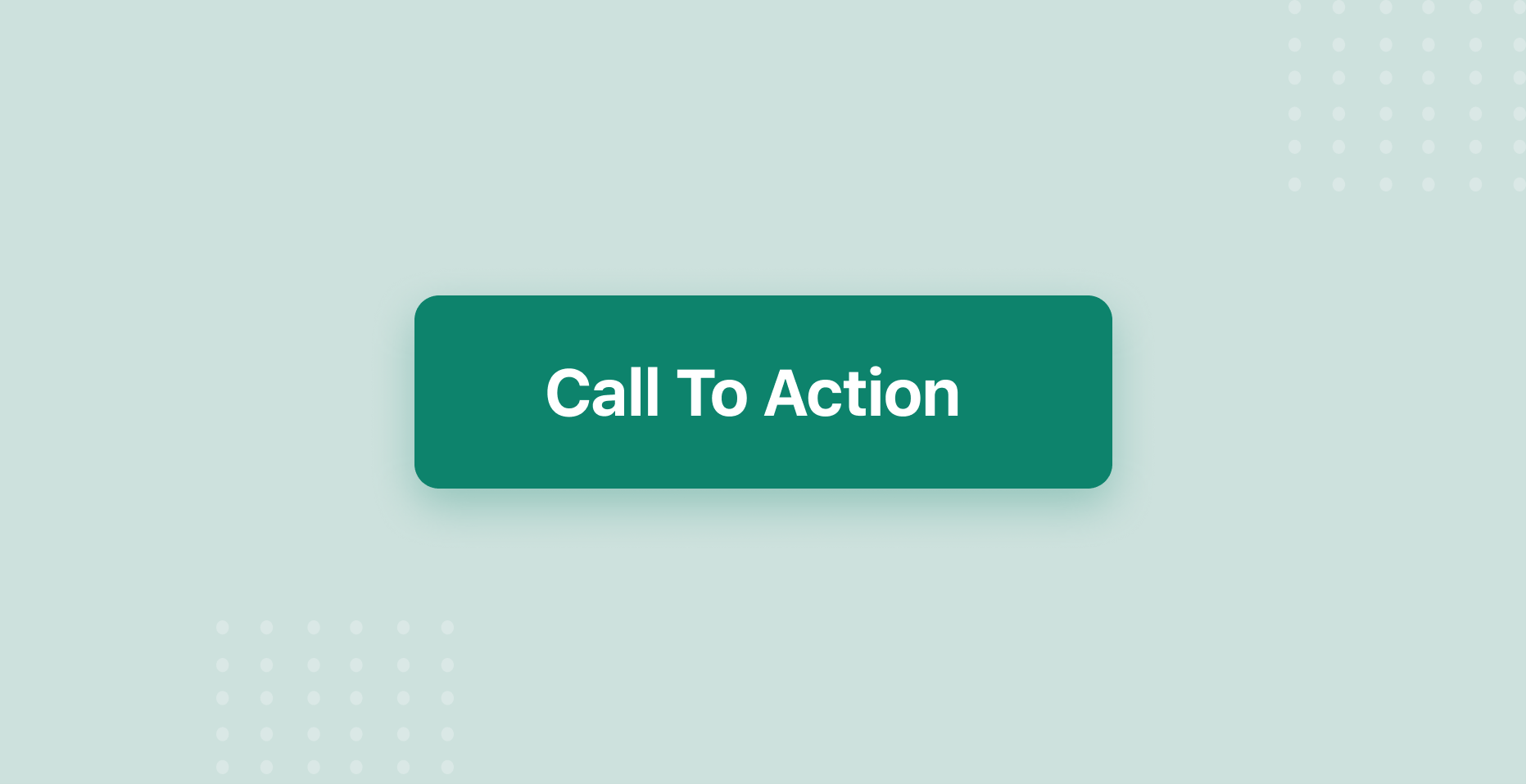
What Is A Call-To-Action Button?
Calls to action are helpful if you want to convert website visitors to subscribers or customers. There are many techniques that you can use, and calls to action have many elements that affect the results. In this post, you can read the best call-to-action buttons that you can use on your website and landing pages.
We call them buttons because they are similar to physical buttons. However, there are different colors, shapes, anchor texts that we can use. The goal is to look natural on a page and have a high click-through rate. Also, call-to-action buttons improve the user experience because they show the next step to the website's visitors.
How To Get The Best Possible Results With Your Call-To-Action Buttons
When you want to improve the conversions of a page, the call-to-action is not the only factor. The quality of the content and the offer will affect the conversion rate, and the traffic will increase your overall numbers.
The call-to-action button connects two different pages. For example, it can connect a blog post with your sales page or a landing page with a contact form. So, if you optimize your call-to-action buttons, you can get more clicks and send more traffic to the important pages of your website.
You can maximize your click-through rate with A/B testing and by getting ideas that work from other websites. A/B testing means that you compare two different call-to-action buttons. You can test different shapes, colors, and words on the same page. For a few effective ideas of call-to-action buttons that work, you can check the examples below.
1. Sign Up - Dropbox
Blue and white colors on the homepage and a simple "Sign Up" call-to-action button below the sign-up form. Dropbox is an example of simplicity. You don't have to try weird and fancy designs when you can explain in a few lines what people can expect from your website. Then, it just gives them the option to create an account.
2. Sign Up For Free - Evernote
When you visit Evernote's homepage, you can understand what this site is all about, and there is a clear call to action. Evernote advertises that you can use it to take notes about everything. The call-to-action mentions that you can "sign up for free" and get started right now. The design is very simple and straightforward. Below the call-to-action button, you can get more information and see more call-to-action buttons in similar colors and the same shape.
3. Try 30 Days Free - Netflix
One of the most effective strategies for more clicks and conversions is to eliminate the visitors' worries. Netflix mentions that you can watch from anywhere, cancel anytime, and the call-to-action buttons invite us to "Try 30 Days For Free". It is a big red button that can get the attention of the visitor right away.
4. Get Started - Square
A simple message that you can get tools for your business and a "Get Started" call-to-action button. Square has a second call-to-action for those who are not ready to create an account with the message "Contact Sales". The placing of the button is interesting as well. It is on the top of the page instead of the center.
5. Sign Up With Email - Canva
The homepage mentions that it is free, you can create designs, and you don't need experience. Then, there are three simple calls-to-action. The last one is highlighted and invite you to sign up with your email. Canva uses three sentences to describe what it can offer and then try to make it easy for the visitor to create an account.
6. Click Here To Start Your Blog - Blogging.org
This website uses a call-to-action button to promote an affiliate offer. We can see the button at the top of the page with small letters, and it is visible from every page and post of the website. However, it does not interrupt the user experience. It mentions a discount to increase click-through-rate and the value of the specific offer.
7. Sign Up To Drive - Uber
The message of Uber is that you can get paid to drive, and the call-to-action makes it clear what you can expect if you click the button. It motivates the visitors of the homepage both to sign up and drive, which is the main focus of the company. It includes a few words, the call-to-action, and if you need extra information, you get them in the main menu.
8. Log in/Sign up - Pinterest
This is one of the simplest call-to-action buttons anywhere on the internet. There is a message that says welcome to Pinterest, and then you can choose to log in or sign up. They use the red and white colors that are the colors of the members' area as well. So, the homepage is optimized both for existing and new members.
9. Try Slack For Free - Slack
The message of Slack shows us the target audience and the goal of the company. It brings together teams of people that work from home. The call-to-action button invites the users to get started for free. Then, there is a second button for those who want to get more information. Overall, it tries to create a friendly environment for people that work from home, and the button adds more value to this positive image.
Conclusion
These were nine great call-to-action buttons that you can use as examples. All these big companies use simple messages and calls-to-action to increase their conversions. The colors are relevant to their brands, and the shapes look nice to the homepages. It is obvious that they don't try to use fancy techniques, but they want to be as clear as possible about the benefits of their companies and offers.